Client
Takumi Ramen & WOEI
The Brief
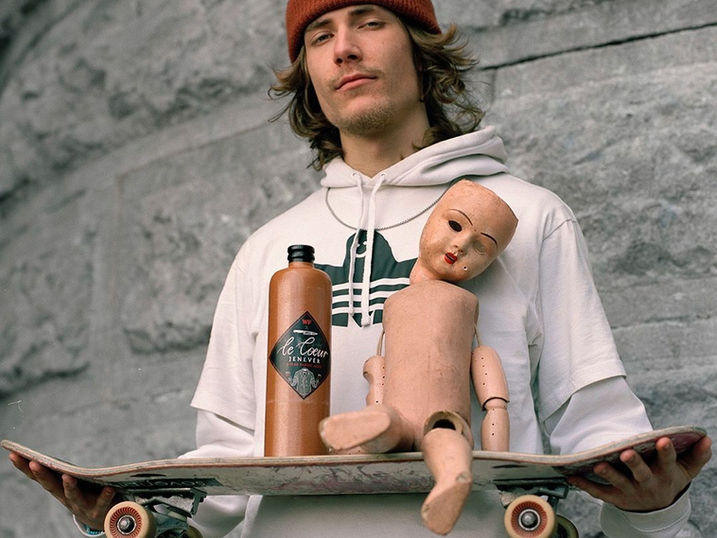
Create a campaign that celebrates the crossover between Rotterdam streetwear brand WOEI and Japanese ramen bar Takumi, blending cultural flavor with street credibility. The goal: launch two limited-edition shirts by Takumi Ogata and drive visibility, hype and in-store activation.
What We Did
We crafted a visual concept that struck a balance between the bold DNA of WOEI and the warm hospitality of Takumi. We created the full campaign around the drop:
– Concept direction & storytelling
– Photo campaign & art direction
– Short brand-movie (featuring ramen contest & behind-the-scenes)
– Launch activation and social roll-out
What It Did
The campaign created immediate buzz across communities; designers, sneakerheads, ramen lovers and fashion fans alike. The in-store drop was a hit, the shirts sold out fast, and the brand-movie sparked conversation around culture & collabs.
A flavorful fusion that left a mark!
Client
Sajoer
The Brief
Create a fresh, elegant brand identity for a local juice bar & café in Rotterdam.
What We Did
Developed the logo, packaging, signage, and brand tone to reflect Sajoer’s organic vibe and visual calm.
What It Did
Helped position Sajoer as the go-to juice destination, clean, conscious, and visually craveable.
Client
Cannibale Royale
The Brief
Cannibale Royale was moving to new territory, to open its first location in Rotterdam. But the Westblaak location had a cursed history: many venues tried, none survived. The mission? Break the spell. Announce Cannibale's arrival with a bang, and a bite.
What We Did
We created a launch campaign with teeth. Real Rotterdammers were cast as the face of the brand, shot raw and honest by Elizar Veerman. Wildposters took over the streets. We made Cannibale feel local, like it had always been part of the city’s soul. Every element dripped with character: gritty, bold, and built for carnivores.
What It Did
We broke the curse. The restaurant launched to a full house and sold out reservations. Locals embraced it as their own. The campaign turned heads and claimed territory, establishing Cannibale Royale not just as a restaurant, but as thé MVP of the Westblaak.
Client
Iron Lady Restaurant
The Brief
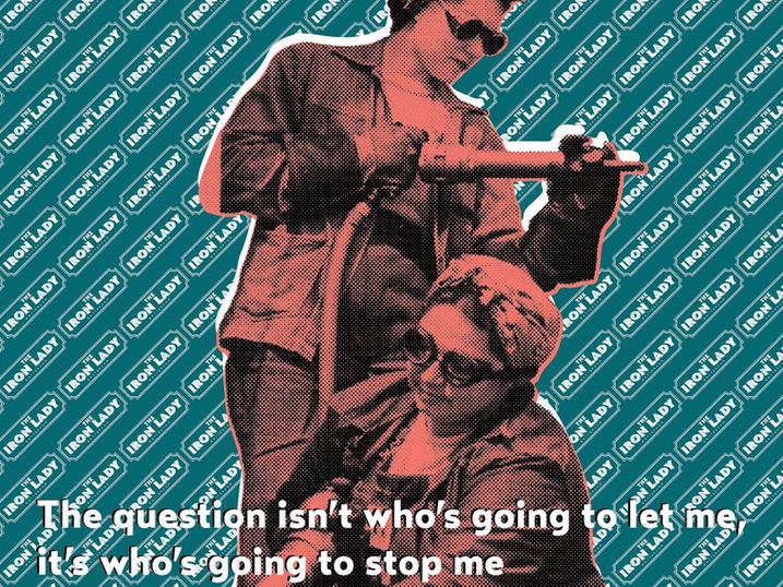
Iron Lady, a new restaurant concept, needed a full brand identity and story from scratch. In a category flooded with man-bun butchers and overcompensating knife imagery, we knew one thing for sure: we had to flip the script. No clichés, just character.
What We Did
We built a brand that celebrates strength through femininity. Bold, witty, unapologetic. Instead of the usual meathead tropes, we honoured the real icons: the first female fighter jet pilot, the first woman to operate a train, and other pioneers you don’t see on a steakhouse wall. The logo, typography, tone-of-voice, and visual language all nodded to empowerment without preaching. Raw but refined. Iron, but with grace.
What It Did
Iron Lady launched with a bang and stayed buzzing. It drew crowds of both women and men who felt the difference. The concept became a talking point, the space became a magnet, and the brand proved that great storytelling isn't just garnish, it’s the main course.
Client
AHOLD-Delhaize
The Brief
Ahold Delhaize, one of the largest supermarket conglomerates in the world, launched Airlab: a new AI innovation platform focused on data, research, and machine learning. They needed a front and backend design that would reflect their cutting-edge ambitions while staying accessible, clear, and intuitive.
What We Did
We redesigned the entire user experience from wireframes to final visuals. We tackled complex data visualisation and translated technical content into engaging visual storytelling. The interface merged clarity with character: clean layouts, subtle motion, intuitive flow. Our work shaped both the user-facing site and the internal back-end structure, ensuring consistency, scalability,
and impact.
What It Did
Airlab launched as a sleek and future-facing platform. Internally, it streamlined collaboration. Externally, it signalled Ahold Delhaize’s serious commitment to innovation. The project proved that AI doesn’t have to look cold or complicated—when designed right, it can invite, inspire, and inform.
Client
KEUNE
The Brief
Celebrate 100 years of Keune: a global haircare brand rooted in family, craftsmanship, and education.
The goal? Design a publication that honours its heritage while inspiring the future, something to educate,
and elevate.
What We Did
We created a publication that told Keune’s story like it does hair; layer by layer. Editorial design met archival material, clean typography danced with rich textures, and every spread celebrated a century of innovation and family spirit. The book doubled as an educational tool for salons and a love letter to the people behind the brand. From layout to print production, we ensured it felt as refined as Keune’s own products.
What It Did
The publication became more than a commemorative piece, it became a conversation piece. Salons proudly displayed it. Staff passed it around. It united employees and customers around a shared story of craft, care, and continuity. A century captured, not just archived.
Client
Noomi Drink
The Brief
Following the success of the Noomi cookbook by chef and cultural curator Sara Shawkat, the next step was to bottle a piece of heritage. Noomi, an Iraqi dried lime drink was ready for the shelves via CRISP. Our mission: develop the full brand experience, from packaging to animation, that would translate cultural depth into modern appetite.
What We Did
We crafted a brand identity that felt both grounded and fresh. The packaging design honoured Iraqi roots with rich patterns and earthy tones, while the visual story embraced a younger, design-savvy audience. We developed animations that brought the brand to life in CRISP’s online environment, inviting, warm, and instantly recognisable. Every detail was considered: from label to motion, tradition met bold design.
What It Did
Noomi stood out as more than a drink it became a cultural marker in the modern fridge. The CRISP launch positioned it as both exotic and everyday. Visibility spiked. Sales followed. And for many, it was the first taste of Iraq, not just on the tongue, but in the story behind it.
Client
La Biennale di Venezia
The Brief
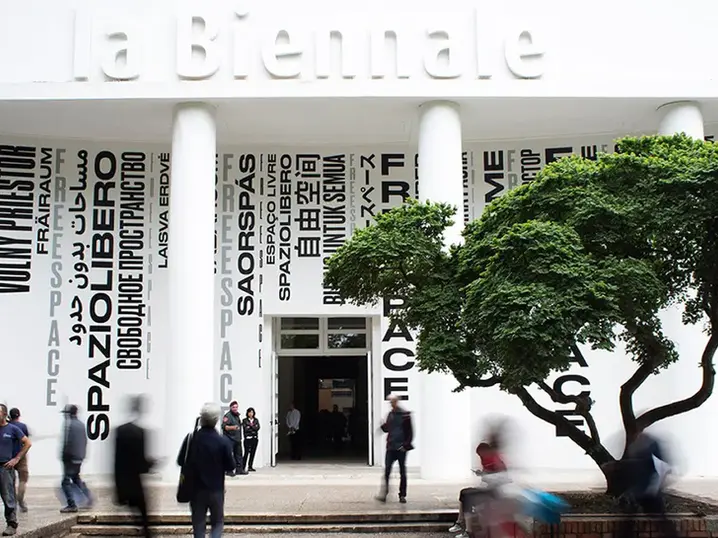
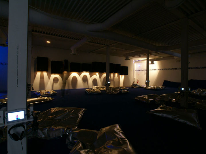
Design the vinyl wall lettering for the Dutch Pavilion at the Venice Biennale. Straightforward? Sure. But for a global stage like this, “just text on a wall” wouldn’t cut it. The exhibition explored virtual space, so why not bring that concept into the physical room itself?
What We Did
We turned type into texture. Instead of standard vinyl, we designed custom-cut pixel blocks, sawn into letterforms, evoking the digital fabric of the virtual. As natural light swept across the pavilion walls, the typography shimmered in light, creating a play of shadow and depth that made viewers pause and stare. The virtual made tangible, through material.
What It Did
What was meant to be wayfinding became a quiet showstopper. Curators, critics, and visitors alike were drawn into the subtle dimensionality of the walls. The installation elevated a functional element into a conceptual gesture, adding resonance to the exhibition without saying a word too much.
Client
Daikin
The Brief
Daikin, the world’s largest air conditioning brand, wanted more than just chilled rooms, they wanted to build a better workplace. As part of their Great Place To Work initiative, they commissioned a special edition of their internal magazine: one that didn’t just inform, but inspired.
What We Did
We took on the project from the inside out, developing the look, feel, and editorial rhythm of the biannual staff publication. We led the visual narrative, directed photography with Elizar Veerman and Lieke van der Wel, and gave the stories a human heartbeat. Every spread reflected Daikin’s people-first mindset, blending corporate pride with genuine personality.
What It Did
The magazine became a mirror, showing employees not just where they worked, but why. It boosted internal pride, strengthened team cohesion, and elevated the company’s commitment to wellbeing and identity. In a business built on temperature, this magazine brought the warmth.
Client
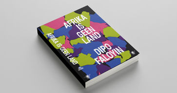
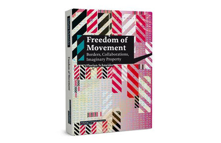
Various – including the Amsterdam University of Applied Sciences, RDM, Port of Rotterdam, University of Design Denmark, Erasmus MC, De Zwarte Hond Architects, NAi010 Publishers, De Bezige Bij, Querido, Singel Publishers, AtlasContact, Networkcultures, and more.
The Brief
Design book covers and full publications that aren’t just read, but experienced. From academic research to literary journeys, from complex data to cultural manifestos, the challenge was always the same: how do you shape information into something physical, beautiful,
and meaningful?
What We Did
We brought stories to life through strong typography, striking colour choices, and smart editorial grid systems. Each publication was treated as a unique design statement, tailored from content to cover. Whether translating dense research into elegant layouts or giving a voice to untold narratives, we took care of the full creative process from concept to print. Design as editing. Form as storytelling. Always with a sharp eye and a soft touch.
What It Did
The books become conversation starters, on bookshelves, in boardrooms, and on bedside tables. They help organisations communicate more clearly, made complex topics accessible, and elevate the reading experience into a tactile journey. In some cases, the design became a reason to read. And that’s our sweet spot: creating timeless objects that not only inform, but inspire.

Client
Architecture Institute Rotterdam
The Brief
AIR, the Architecture Institute of Rotterdam, asked us to bring their floating pavilion installation to life, across three boats docked on the water, as part of the Rotterdam Architecture Month. The goal: create a brand movie that captured not just the structures,
but the spirit behind them.
What We Did
We went full throttle. Using a blend of FPV drones, cinematic camera setups, and a nimble production crew, we shot the boats and the city in their best light, literally and conceptually. We framed the installations not just as objects, but as statements about architecture, movement, and public space. Editing, color grading, sound design,
all tuned to match the rhythm of the river and the energy of Rotterdam.
What It Did
The film became the centrepiece of the campaign. It drew clicks, shares, and praise, not just from the architectural community, but from the public at large. The brand movie transformed the installations from passive objects into cultural landmarks, and put AIR’s vision on the map, locally and internationally.
Client
Erasmus Medisch Centrum
The Brief
Create a publication for young adults diagnosed with cancer. Not a brochure. Not a pamphlet. A book, that offers information, space, support, and hope. Erasmus MC and the Antoni van Leeuwenhoek initiated this pilot project with one goal: to help AYA’s (Adolescents and Young Adults) navigate the unimaginable. Our task? Design something that felt gentle, clear, and deeply human.
What We Did
We treated the book as more than a container, it became a companion. From layout to typography to material choice, we approached the project with empathy and restraint. No overwhelming visuals. No design for design’s sake. Just a carefully balanced system that respected the content and its emotional weight. The idea of 'boekverzorging' came to life here: designing as a form of care. Every page was calibrated to inform and support without triggering or overwhelming.
What It Did
The book was published in a limited run and distributed directly to AYA patients in Erasmus MC and Antoni van Leeuwenhoek. It became a strong asset, praised not only for its content, but for its calm, open tone. Patients, families, and medical professionals all recognised its unique presence: hopeful, helpful, and honest. More than a design project, this was an act of solidarity, one we hope reaches many more hands and hearts in future editions.

Client
Acorel


